Create Eye-Catching Social Media Visuals Without a Designer
Do you use visuals in your social media? Would you like to have tools and tips to help you create images? Discover how to you can create great social media visuals when you’re not a designer. We will share why social media marketers should care about visuals.
You’ll discover what to consider before you design images for social media and learn about new tools to help you. We’ll share what marketers need to know about social media visuals and how to create visuals without a designer.
Why You Should Care About Social Media Visuals?
Because news feeds are so busy these days, marketers need to do everything they can to capture attention. Visuals catch that attention and typically drive users to take some sort of action because visuals support an emotional connection.
Fast-growing channels such as Periscope and Snapchat are highly focused on visual content, as are Instagram and Pinterest. She also notes that traditional platforms Facebook, LinkedIn, and Twitter are giving more attention to visual content and users are 44% more likely to engage with content that contains pictures.

Visual content engages users more quickly, and the use of video is also on the rise. Socialbakers research shows that brands are now uploading more video directly to Facebook than YouTube. About 80% of all video engagement is coming from Facebook native video. That’s before Facebook Live is really being measured.
Plus, 110 years of video footage is watched on Periscope every day. According to the Content Marketing Institute, out of a range of priorities for content creators, visual content is in the top three. Visual content is a very important topic because it works. Marketers just need to find out where to start and how to produce and use images efficiently.
Getting Started With Images
Before you start to design images, you need to think about what types of visual content get shared well on which platforms. Content that’s effective on Facebook might be different from what works on Instagram, which might be different from Twitter.
People get overwhelmed trying to do visual content on every platform and it’s better to focus on visuals for one particular platform at a time. You shouldn’t jump into visuals on a new platform until you have systems in place for visuals on the one before it.
Donna Moritz developed the Visual Content Blueprint, which is the five elements that help you create images that work.
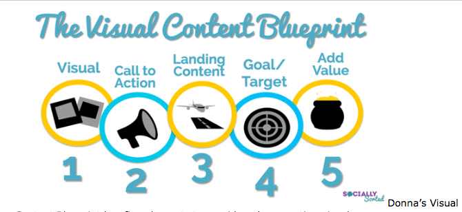
Five elements to consider when creating visuals.
First, decide what image you need and what works on the targeted platform. Then consider your call to action. Your image could be asking for more connection or engagement, driving more shares or click-throughs, or a combination.
Next, think about your landing content, where people arrive when they click through or share. Will people get more information, blog content, a free download, or something else of value? Make sure users are achieving some sort of goal.
Do you want them to sign up for something, read a blog post, or stay on your website? Every image should be able to stand alone. That way, if something is pinned or shared out of context, people will still understand what you’re offering and how to get it.
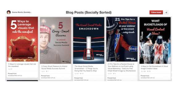
Add text to your images to help them stand alone, but also include descriptions. You should think of images as a two-pronged approach. You need to have something on the image that provides context, either on the image itself or with a text overlay in a header. Then you can add more information in the description.
Many social platforms, like Facebook and Pinterest, allow the description to be clickable, so you can include a URL. Since that’s not an option for Instagram, marketers need to get creative and use the bio link to drive people where they want them to go.
Your first step to doing well with visuals is to have a system for planning, collecting, creating, and sharing images.
Types of Visuals
About a year ago, Donna created what she calls a “visual hierarchy,” which helps her decide where to invest her time and resources when creating visuals. Her visual hierarchy breaks into three levels: shareables, step-by-steps, and showpieces.
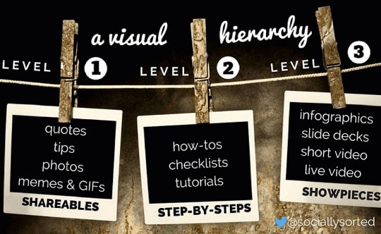
Shareables are images that are easy to create and share, such as quotes, tips, memes, photos, and GIFs. You can search for existing GIFs on websites such as Giphy or use a tool to make your own from your videos.
Shareables spark engagement or building connection, and for keeping yourself front and center. For example, anything that’s bright, shiny, and new captures users’ attention. If you’re creating original content, especially on Facebook, other pages will eventually discover you and look to you for content to share.
Remember to brand your images in some way without over-branding. Instead of putting your URL, your name, and your logo on an image, it’s suggested that you select and focus on one element.
The next category of visuals is called step-by-steps. These are how-to images, checklists, and tutorials, and are the sorts of images you see on Pinterest. Anything that saves people time gets snapped up and shared really well.
These may take you a little bit longer to create. You may do a screenshot and add annotations to show how to do something. For example, if you’re a fitness instructor with how-to exercises, you would create multi-image, multi-step pieces of visual content.
From there you get into showpieces, which take more time and resources. Showpieces are visuals like infographics, SlideShares, short video, and live video or live-streaming. Marketers need to put a little more effort into these types of content, especially if they’re repurposing it.
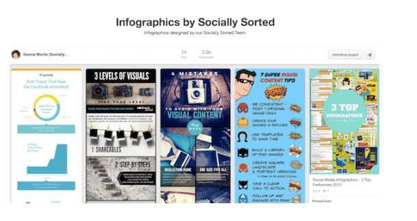
Step-by-step images are good for platforms other than Pinterest. Now shorter infographics, even those that are 2000 or 2500 pixels or shorter will share well on Pinterest, Facebook, LinkedIn, and Twitter. You can look for full- and half-length infographic templates on Canva.
Screen captures with annotations for how-tos are also effective. You can use a screen capture tool to talk about new features on Facebook. Things like that get shared like crazy and believe it’s the perfect way to show how to do something on your screen.
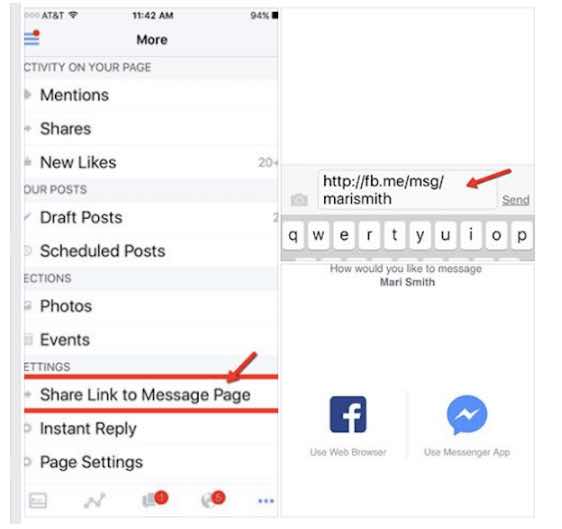
You can add annotations to screenshots to show how to do things. You might use something like Snagit or Skitch by Evernote for these visuals because they’re easy, quick annotation tools. You can also use Jing, which grabs the screenshot and allows you to highlight certain words, draw arrows, draw boxes, and upload it to a website or save it with a click of a button.
Desktop Design Tools for Non-designers
Canva is a great tool for creating visuals. Canva also has wonderful stock images, which is an inexpensive image source. Pixabay is a terrific source for free stock photos which can be used on commercial sites. With Canva for Work, you can do a lot of cool things like resize your images, collaborate, upload branding assets, organize designs in folders, do multiple resizes, and more.
The other two tools that have changed the landscape for creating visuals are Relay and DesignFeed. Both tools automate the creation of visual content and allow a little bit of customization, basically allowing images to design themselves.
With Relay, you basically load all of your assets, then add things such as your logo, a tagline, a hashtag, or URL. When you narrow down to a particular design, you can change the assets and Relay will automatically reflect the changes throughout each of your designs. This makes Relay great for batching visuals for podcasts, Facebook, and so on.
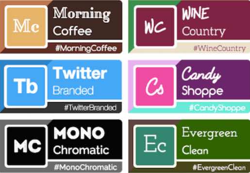
DesignFeed is similar and simple to use. The difference between the two is that DesignFeed has access to Unsplash and a couple of other stock image libraries. It uses the text you load to choose images from the libraries and create visuals automatically.


